|
|
|---|
| Queen - News of the World Tour - Visuals - Case Study |
|---|
 |
|---|

| The Brief |
|---|
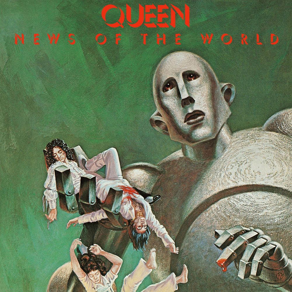
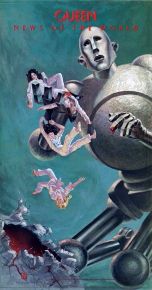
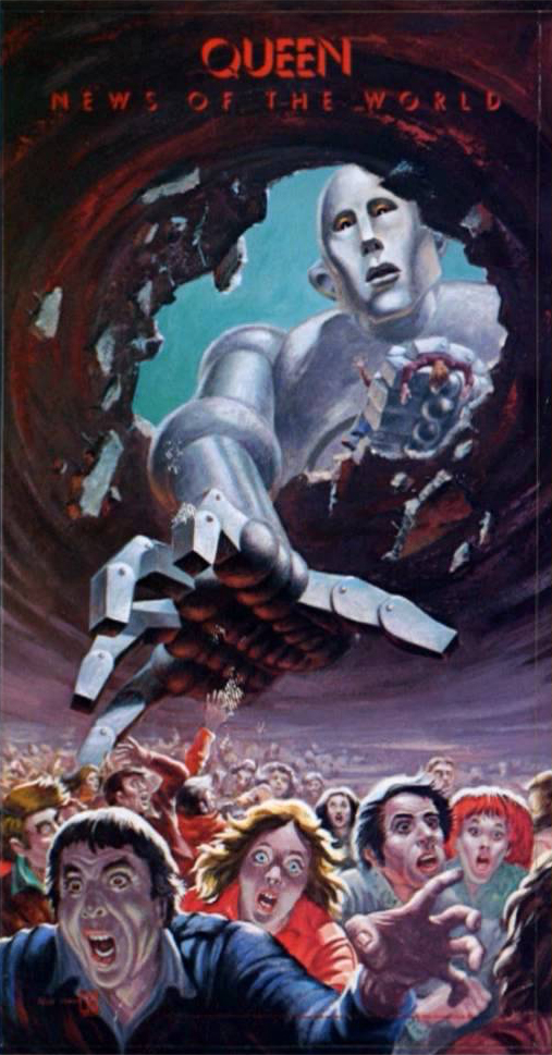
One of the more technical pieces I've made recently was making and moving Frank, a huge robot, for Queen & Adam Lambert's 2016 tour. Here is an overview of the process and workflow that went into his creation. Another one for Treatment, and the usual crew, with Lizzie Pocock and Sam Pattinson dealing with the client side of things and Emile Freeman directing the visuals. |
 |
 |
 |
|---|
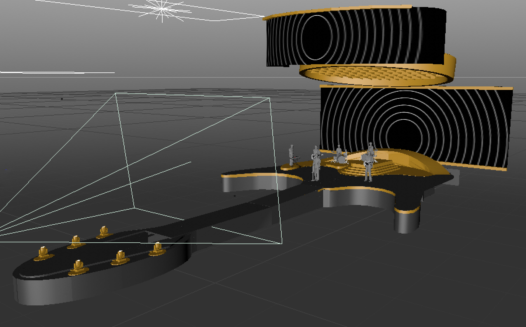
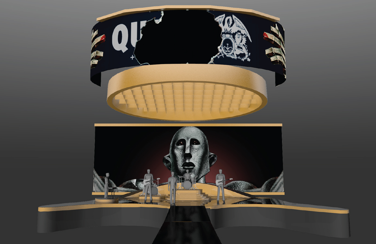
I was supplied with a visual mockup of the stage that showed the scale and how the curved front screen flew up to reveal the band at the start of the show. Deliverable tech specs were unknown at this stage but were: |
 |
 |
|---|

| Modelling |
|---|
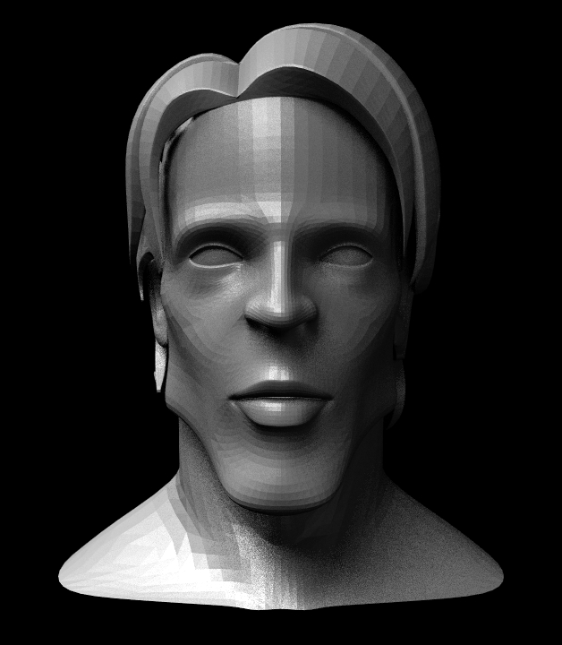
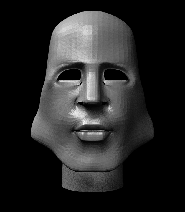
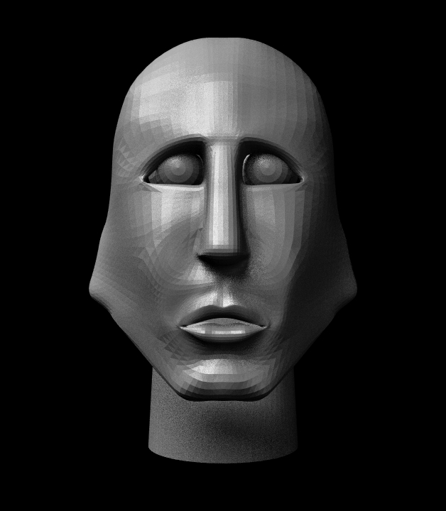
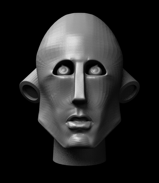
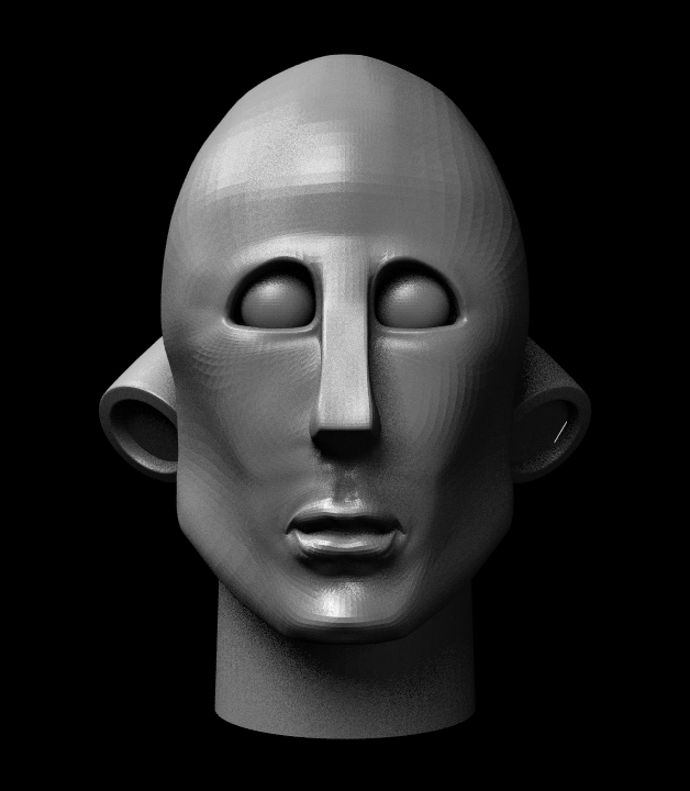
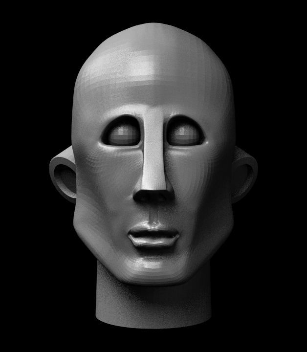
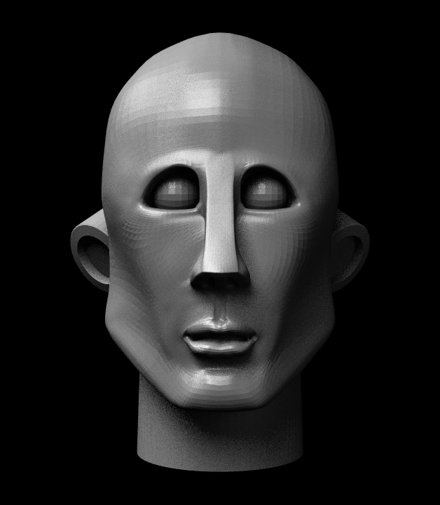
Focused on the face first, body was fairly simple, likeness was the key; had to be instantly recogniseable as the artwork. Found a relatively low poly model online with a decent poly flow that had some facial similarities to Frank - square chin, hollow cheeks not too complicated eye brows. It went through nine rounds of revisions before we were happy with it and had achieved a workable likeness. |
 |
 |
 |
||
|---|---|---|---|---|
 |
 |
 |
||
 |
 |
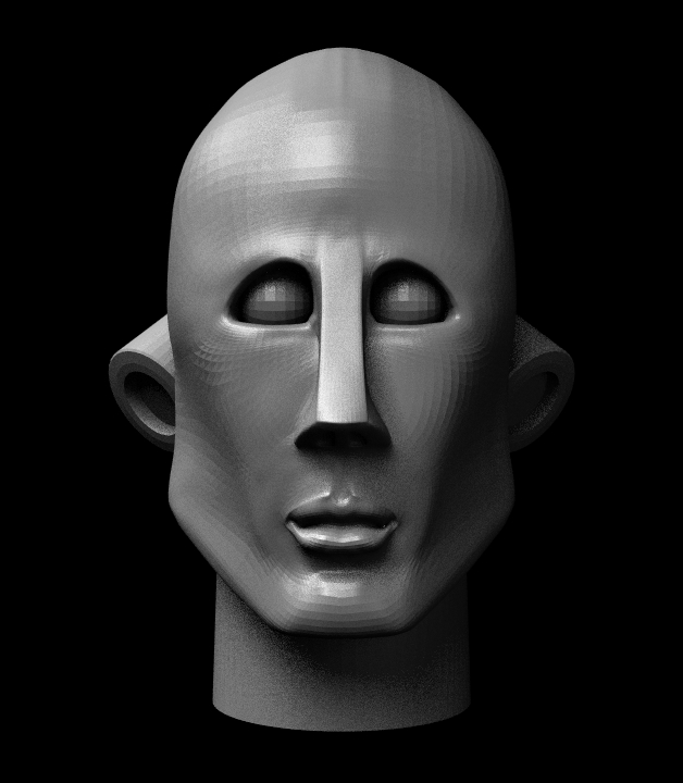 |
Then a few more iterations on the head - version 9 was approved and onto texturing. |
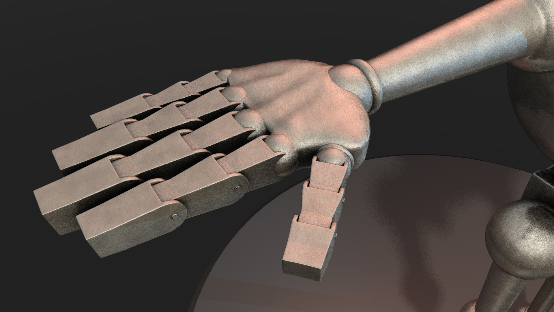
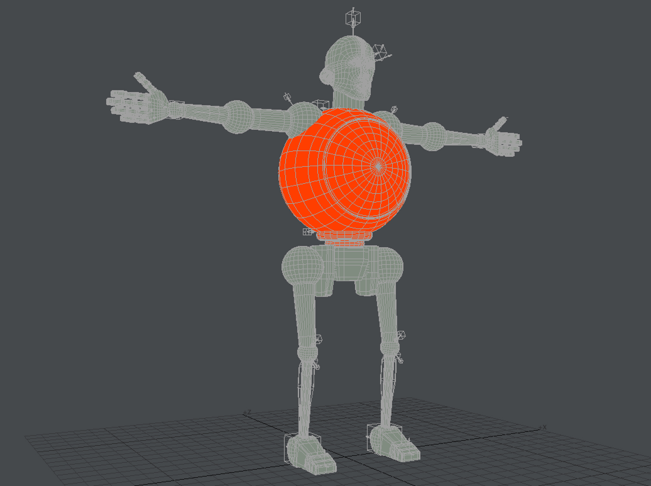
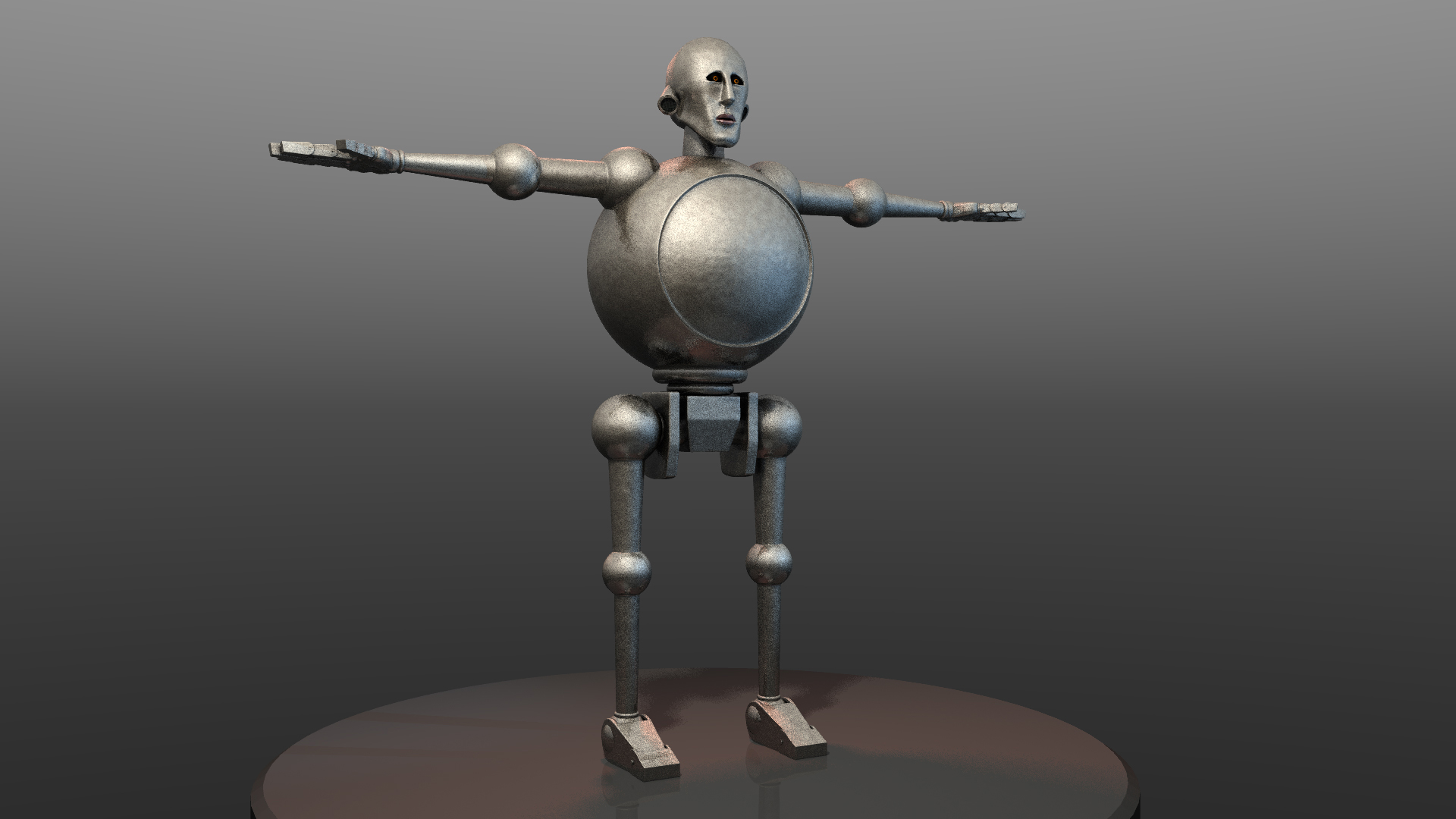
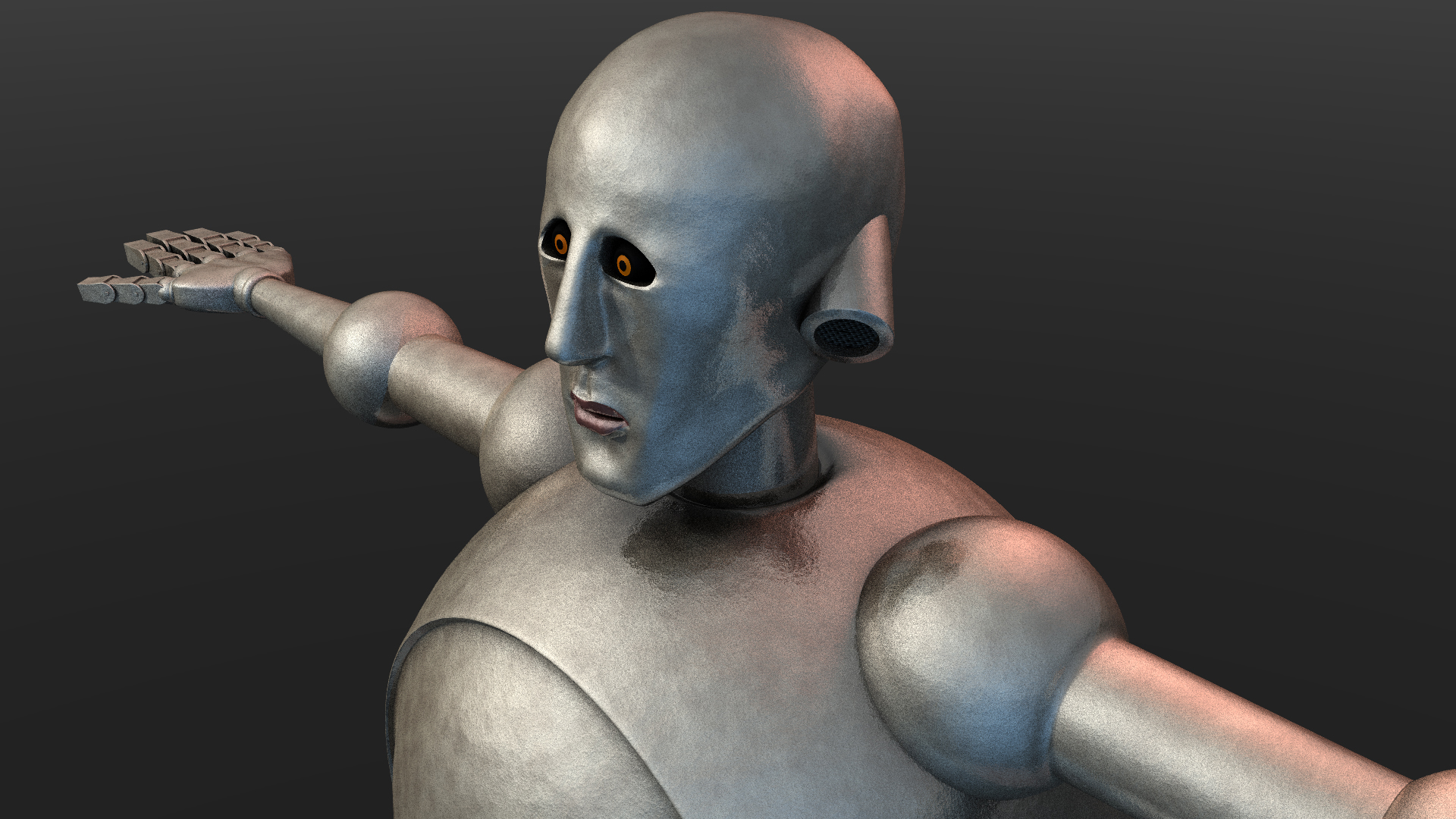
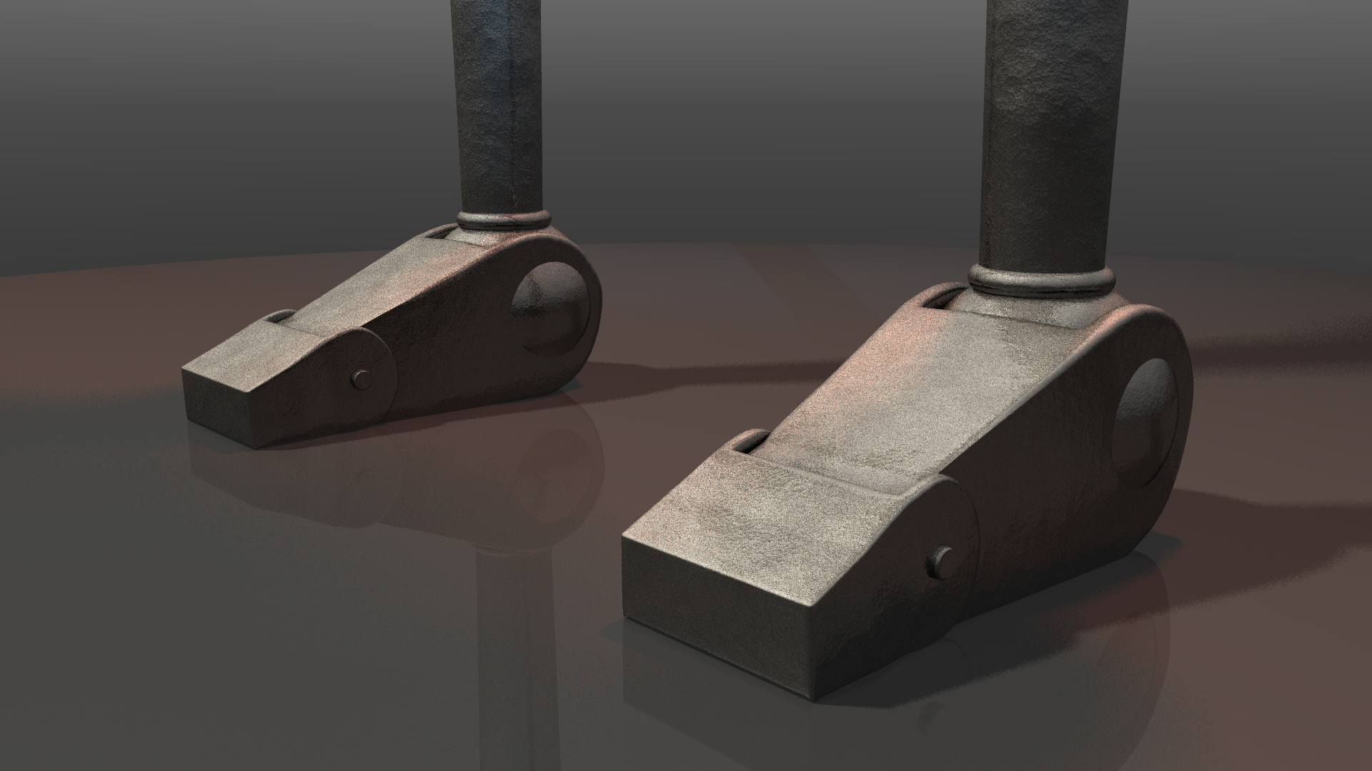
The body was fairly easy to build; mostly circles or tubes, the finger elements clones of each other. It was mostly guesswork on sizes and proportions, and he ended up probably a little short compared to the artwork, but this helped the crouching down shot, especially as it was to be shown on an extreme widescreen ratio. I did this whilst waiting for face feedback, which will explain the version 5 head seen in these grabs, and the dummy texture: |
 |
|---|
 |
|---|
|
 |

| Rigging & Texturing |
|---|
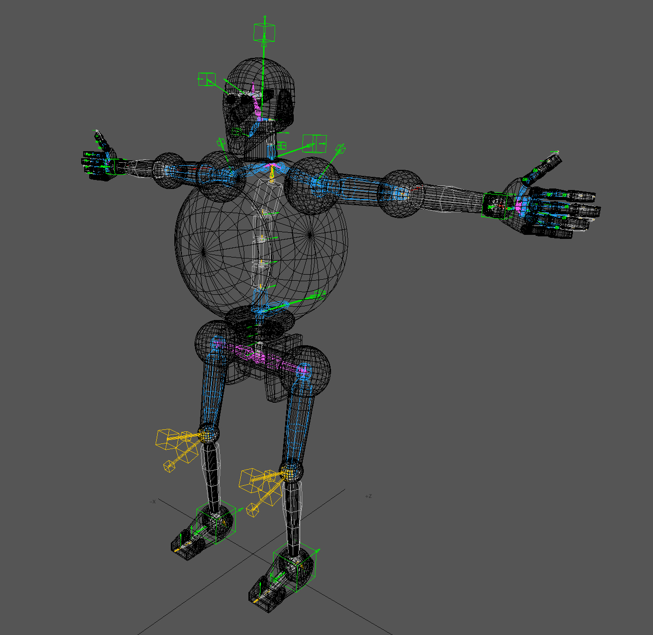
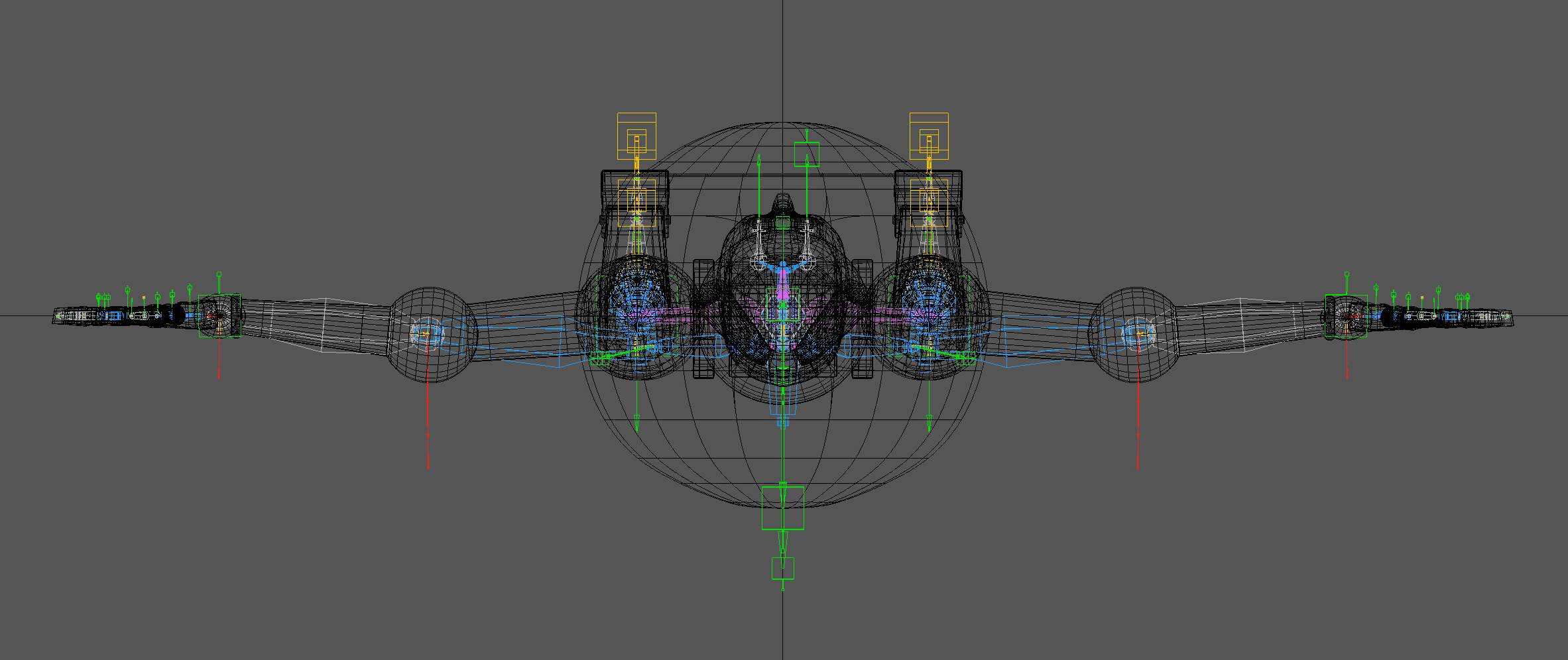
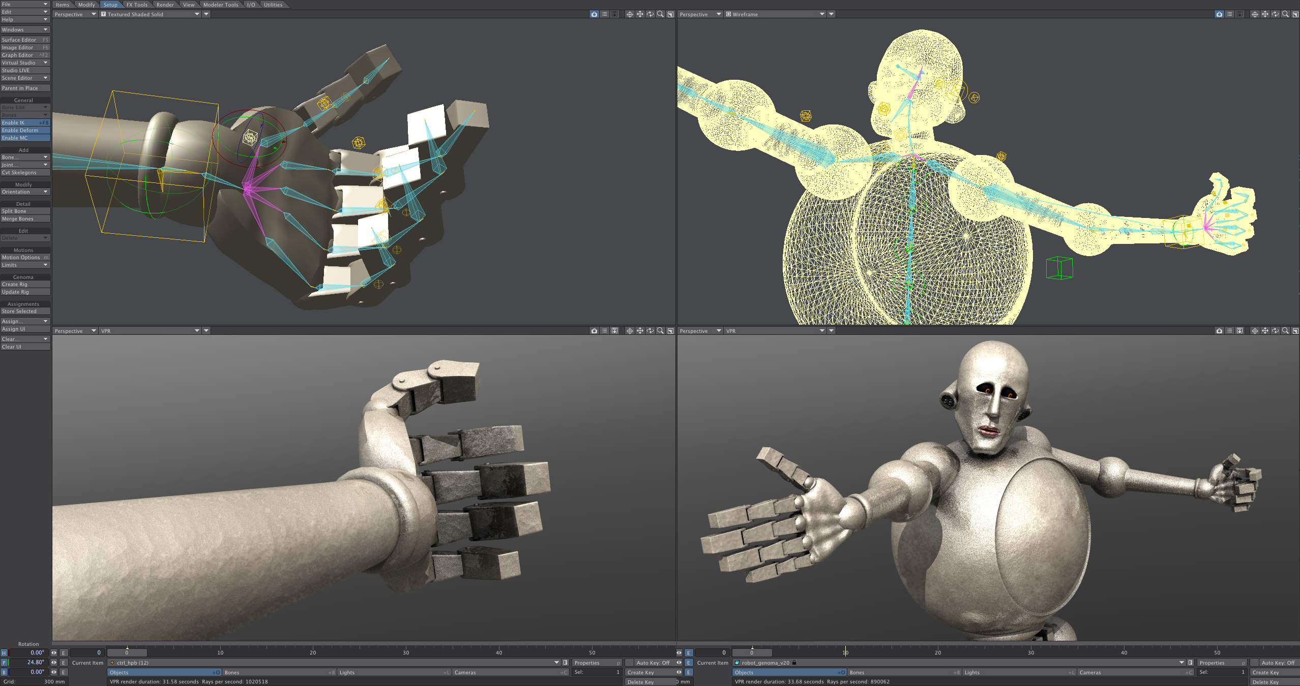
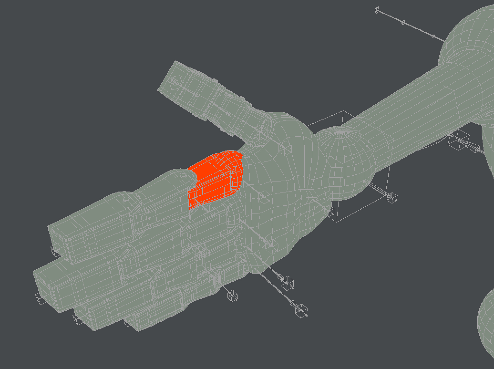
A simple human biped preset rig was used on the t-pose model and was tweaked it to fit; stretched out a few bones, locked some axes I didn't need, adjusted the eye controllers and target, rotated the hands so the palms faced horizontally instead of vertically: |
|
|
Once happy with that after some initially testing, weight maps were applied to control the deformation. Special attention was paid to the fingers and eyes as they'd be the focus of the piece. |
|
 |
Bone and muscle deformation crash testing came next. A few joint limits were added, the rig cleaned up more, various unnecessary controllers were removed or hidden and the weight maps blended where necessary. |
|

| Animation |
|---|
Once I'd set up the main poses for each shot and was confident it would work the next step was to actally animate and bring him to life. Reference movies from Emile with timings and actions was vital for each shot due to character animation being fairly labour intensive. Those supplied were perfect - he even laid down a temporary sound bed which really helped achieve the feeling of weight and scale which fed back into keyframing. |
The Intro was the biggest piece by far; Frank stomps around behind the stage, shaking it with each thumping footstep before smashing his fist through it, peers through the hole he's made, then lifts the entire wall up to reveal the band and the opening number as it all kicks off. As the front screen was lifted he was to be seen on the rear wall, so perspective and scale had to be accurate. Smashing the wall was created using a mixture of collision dynamics to throw the rubble forward, geometry morphing created the bent metal edges left behind and soft dents when he leans on the back of the screen. Again. Emile's animatic was spot on for timings and kayframing reference: |

| Supplied Outputs |
|---|
Positive response from the client with just some small tweaks: could the eyes be blue for the lift to space to match the scene, and would it be possible to have a rusty coloured wall rather than blue? No problem. Here are the final renders, with full lighting and textures: |

| Final |
|---|
During rehearsals it was decided that the screen tap and wall open weren't needed and the lift up hand that took Brain May to space needed a few more revisions to get right. By rotating and flattening it we could show the thumb, which really helped sell the idea. |
|
 |
|---|
| © Mark Hough / respective clients |
|---|
